Quinto Sports New Trek Uniform
1 min read
Another picture has emerged of the new Star Trek uniforms.
This one features Quinto as Spock.
Previous photos from Screencrush showed the red uniform top as worn by Scotty.
With this recent photo (click thumbnail below for full-sized image), it’s easier to see the details of the uniform.
Plus – it looks like Spock has been in a bit of a scrap, going by the dirt/bruising on his hand.


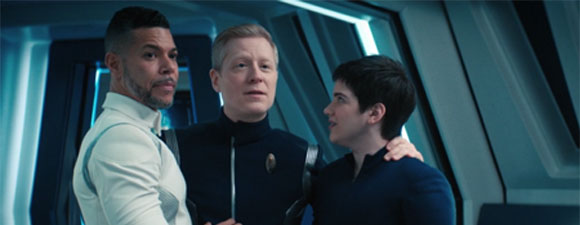





This looks OK, although the previous one looked better. The little bit of black collar is confusing — as if they couldn’t decide whether to ditch it all together and left a little bit of contrast. It’s also more structured — why not, in 2015, go with a tighter fitting uniform like TOS and take advantage of a young, fit cast? But they really missed the point with a more structured uni — the idea of a paramilitary service using such a loose, casual tunic (in TOS) as a service dress uniform was an interesting idea. But it’ll do.
His hair looks strange, as if he’s wearing a wig. And they need to put different make-up on him; Spock’s skin is supposed to be yellow, not pink!
Yeah, I think these new uniforms are a mistake. Even JJ-haters generally found the ST09/STID uniforms acceptable, but these new ones look boring and awkward. The Wiggles in space, anyone?
These look cheaper. The other design had a lovely tiny repeating pattern of the Starfleet arrow emblem for texture.
It reminds me of the ill-fitting uniforms in Star Trek: The Motion Picture. Also, the photo of Zack is flopped (that is, it’s backwards, as if in a mirror).
Three tone? What, are we going for the Lost in Space look now? Maybe one day someone will recast this abomination and put TOS back on TV, kinda like Phase II is doing. The acting may blow, but at least they respect the material
I’ve spent a few decades studying and working with Trek costumes. I’m glad the little “arrowheads” are gone from the tunics, and like the silhouette of this new uniform better than the past two movies (where they were far too loose). I’ll have to see them in action beyond Pegg leaping around to really have an opinion, though.
Mirror Spock???
You can tell that they are missing the repeating pattern from those low-res images? Kudos to you then
Just draw a goatee on Zack’s photo and he’ll be all set!
Miniature turtle necks. Yuck. They look stuffy. I guess they need them to hide the inevitable expanding chins and necks. The two tone primes on the tunics look bad. It seems they made the change to just make a change but it went from bad to worse. Pee Yew.
The uniforms in STTMP are the only ones that ever convinced me they could exist in the real world, except maybe the tunics from the later NextGen films.
They do look cheaper. And less interesting.
I hate the collars.
Why oh why did they change the uniform designs… yet again!? In the context of TOS and the five year mission, it doesn’t make sense, because the first two movies had the design right for the five year deal. Not to mention, in the the context of a military organization’s homogenization & uniformity , it doesn’t make sense. On top of all that, these new designs have odd, cheap-o bought ’em at Wal-Mart on special kind of vibe. Ug-Ly. The Wiggles in Space… yep.
wow those new uniforms are disgusting..yuk..what was wrong with the previous uniforns? nothing, so why change them for those..